library(tidyverse) # read in tidyverse package
library(janitor) # read in janitor package
library(here) # read in here package
library(showtext) # read in showtext package
library(DHARMa) # read in DHARMa package
library(MuMIn) # read in MuMIn package
library(ggeffects) # read in ggeffects package
library(effsize) # read in effsize package
library(gtsummary) # read in gtsummary package

kelp <- read_csv(here("data", "kelp.csv")) # save giant kelp frond data in new object called kelp
mopl <- read_csv(here("data", "mopl_2019.csv")) # store Mountain Plover data in new object mopl
mydata <- read.csv(here("data", "my_data.csv")) # store personal data in new object mydataFinal
Set Up
Problem 1. Research writing
a. Transparent statistical methods
In part 1, they used a linear regression test, because they were testing whether one continuous predictor variable, precipitation, predicts another continuous variable, flooded wetland area.
In part 2, they used a Kruskal–Wallis test, because they were comparing the median flooded wetland area across more than two groups: wet, above normal, below normal, dry, and critical drought. Differences in median can best be measured by nonparametric test, which in this case is Kruskal-Wallis test instead of ANOVA test.
b. Figure needed
My coworker should use boxplot to give context to the test. The x-axis should show water year classification, with the five categories: wet, above normal, below normal, dry, and critical drought. The y-axis should show flooded wetland area (m²). Additionally, my coworker should include line within the box for medians, edge of the box showing interquartile range, whiskers to show spread, and jittered points overlaid on the boxplot to show distribution and individual observations. This would allow readers to visually compare flooded wetland area across the five water year classifications side by side along with medians, which fits well with a Kruskal–Wallis test because that test compares differences among groups without assuming normality (non-parametric).
c. Suggestions for rewriting
Part 1: Precipitation was not a significant predictor of flooded wetland area in the San Joaquin River Delta. In other words, variation in annual precipitation was not associated with a detectable change in flooded wetland area in this analysis (linear regression, F(df for whole model) = F statistic for full model , R2 = coefficient of determination for model, p = 0.11, α = significance level).
Part 2: Median flooded wetland area did not differ significantly among the five water year classifications- wet, above normal, below normal, dry, and critical drought. (Kruskal–Wallis test, χ2 (degrees of freedom) = test statistic (H), p = 0.12, α = significance level).
d. Interpretation
One additional variable that could influence flooded wetland area is water management actions of the river, including water extraction from the river, which would be continuous (volume of water diverted from the San Joaquin River, or CUMECS of water extracted continuously throughout the year). This could influence wetland flooding because greater water extraction from the river may reduce the amount of water available to enter or remain in wetlands, leading to smaller flooded areas.
Problem 2. Data visualization
Reed, D, R. Miller. 2025. SBC LTER: Reef: Kelp Forest Community Dynamics: Abundance and size of Giant Kelp (Macrocystis Pyrifera), ongoing since 2000 ver 30. Environmental Data Initiative. https://doi.org/10.6073/pasta/c05388280c63f9effa0c71bf5908be1e. Accessed 2026-03-11.
a. Cleaning and summarizing
kelp_clean <- kelp |> # store kelp data in new object kelp_clean
    clean_names() |> # clean column names so it only has lowercase and underscores

  filter(site %in% c("IVEE", "NAPL", "CARP")) |> # keeps only observations from Isla Vista, Naples, and Carpinteria

  filter(!(date == "2000-09-22" & transect == "6" & quad == "40")) |> # removes the single unwanted observation from transect 6, quad 40, on 2000-09-22

  mutate(site_name = case_when( # creates a new descriptive site_name variable from the site codes
    site == "NAPL" ~ "Naples", # mutate site name from NAPL to Naples
    site == "IVEE" ~ "Isla Vista", # mutate site name from IVEE to Isla Vista
    site == "CARP" ~ "Carpinteria" # mutate site name from CARP to Carpinteria
  )) |>

  mutate(site_name = as_factor(site_name), # converts site_name to a factor
         site_name = fct_relevel(site_name, # set the order of levels manually
                                 "Naples", "Isla Vista", "Carpinteria")) |> # order = Naples, Isla Vista, Carpinteria

  group_by(site_name, year) |> # groups the data by site and year so summary statistics are calculated within each group

  summarize(mean_fronds = mean(fronds)) |> # calculates mean frond count for each site-year group
  ungroup() # removes grouping so the result is a regular data frame

kelp_clean |> slice_sample(n = 5) # slice 5 samples from the kelp_clean data frame
# A tibble: 5 × 3
site_name year mean_fronds
<fct> <dbl> <dbl>
1 Isla Vista 2009 30.2
2 Carpinteria 2009 9.43
3 Naples 2011 5.32
4 Carpinteria 2021 6.13
5 Carpinteria 2001 4.42str(kelp_clean) # display structure of kelp_cleantibble [77 × 3] (S3: tbl_df/tbl/data.frame)
$ site_name : Factor w/ 3 levels "Naples","Isla Vista",..: 1 1 1 1 1 1 1 1 1 1 ...
$ year : num [1:77] 2000 2001 2002 2003 2004 ...
$ mean_fronds: num [1:77] 1.8947 0.0606 3.0111 9.2596 7.8141 ...b. Understanding the data
That observation was filtered out because the fronds value for date 2000-09-22, transect 6, quad 40 was -99999, which is not a real frond count. Instead, it is a missing-data code indicating that data were not collected or that the datasheet was lost for that observation. I found this explanation in the Methods and Protocols section of the Santa Barbara Coastal LTER dataset documentation and in the Notes column of the dataset csv.
c. Visualize the data
font_add_google("lato") # downloads/imports the Google font "lato"
showtext_auto() # render text in plots using showtext, so the custom font appears correctly

# ggplot base layer call
ggplot(data = kelp_clean, # select kelp_clean data frame
       aes(x = year, # use year column as x-axis
           y = mean_fronds, # use mean_fronds column as y-axis
           color = site_name)) + # color based on sites
  geom_point() + # first layer: points
  geom_line() + # second layer: lines connecting points
  labs( # labels
    title = "Sites vary in mean kelp fronds per year", # label title
    x = "Year", # label x-axis title
    y = "Mean kelp fronds per year" # label y-axis title
  ) +
  scale_color_manual( # manually change colors
    name = "Site", # label legend as Site
    values = c(
      "Naples" = "#2A9D9A", # assign light blue color to Naples plot
      "Isla Vista" = "#C9A294", # assign peach color to Isla Vista plot
      "Carpinteria" = "#7E9190")) + # assign gray color to Carpinteria plot
  theme_minimal() +# choose minimal ggplot theme
  theme( # theme function call
    plot.title = element_text(hjust = 0.5, size = 14), # adjust title position and size
    panel.border = element_blank(), # eliminate plot borders
    text = element_text(family = "lato", color = "black"), # customize text font and color
    axis.title = element_text(size = 13), # change axis font size
    axis.text = element_text(size = 11), # change axis text size
    legend.title = element_text(size = 13), # change legend title font size
legend.text = element_text(size = 11)) # change legend text size 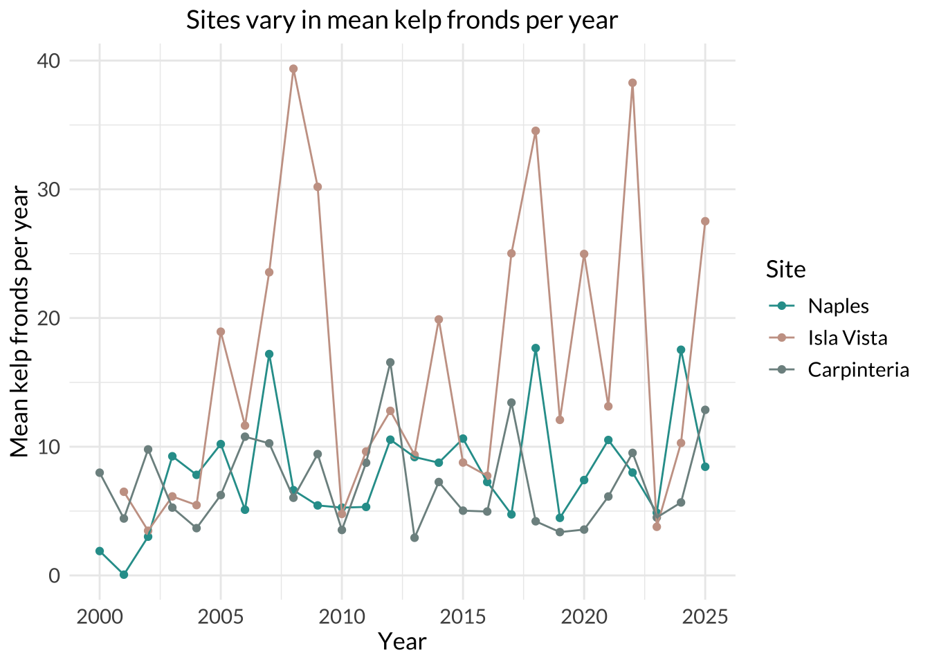
d. Interpretation
Isla Vista had the most variable mean kelp fronds per year because its line and points show the largest fluctuations over time, ranging from around 5 to 40 fronds per year. The steep rises and drops in the Isla Vista series indicate much greater year-to-year variation than the other two sites.
Carpinteria had the least variable mean kelp fronds per year because its line stays relatively flat and spans a narrower range of y-values than the other two sites, remaining mostly around 3 to 13 fronds per year with one higher point (Naples have ~3 that goes higher than 13). This indicates smaller changes from year to year compared with Naples and Isla Vista.
Problem 3. Data Analysis
a. Response variable
In this study, 1 represents a site that was used as a Mountain Plover nest site, and 0 represents an unused available site within a prairie dog colony. The Methods state that the nest-site selection analysis used a “use vs. non-use framework,” where used sites were actual nests and unused sites were randomly selected points within colonies where no plovers or nests were detected that year.
b. Purpose of study
Visual obstruction: Visual obstruction is a continuous variable, measured with Robel pole readings at the nest and nearby points, so it represents how much vegetation height and density block visibility. As visual obstruction increases, the probability of Mountain Plover nest site use would likely decrease because the paper describes how plovers select nest sites with low vegetation height. Relation of flat surface + low vegetation height and Mountain Plover nesting was described in Introduction, paragraph 2, and in the Methods section, Adult Mountain Plover Density, Data-Collection, paragraph 3 where visual collection measurements were described.
Distance to prairie dog colony edge: Distance to prairie dog colony edge is also a continuous variable, because it measures how far a site is from the edge of a prairie dog colony. As distance from the prairie dog colony edge increases, the probability of Mountain Plover nesting would likely decrease because the prairie dog activity creates disturbances (short vegetation and open ground) that Mountain Plovers favor. The relation between Mountain Plover and prairie dogs is described in Abstract, and also Methods section -> Adult Mountain Plover Density -> Modeling framework, paragraph 1.
c. Table of models
| Model number | Visual Obstruction | Distance to Prairie Dog Colony | Model Description |
|---|---|---|---|
| 0 | no predictors (null model) | ||
| 1 | x | x | all predictors (saturated model): Visual Obstruction + Distance to Prairie Dog Colony |
| 2 | x | Visual Obstruction only | |
| 3 | x | Distance to Prairie Dog Colony only |
d. Run the models
mopl_clean <- mopl |> # store mopl data frame in new object called mopl_clean
  clean_names() |> # clean column names so it only has lowercase letters and underscores
  mutate(
    used_bin = if_else(id == "used", 1, 0)) |> # create used_bin column and assign 1 to used nests, and 0 to others
  select(used_bin, edgedist, vo_nest) # select columns to save in the new object mopl_clean

# model 0: null model
model0 <- glm( # generalized linear model
  used_bin ~ 1, # no predictors
  data = mopl_clean, # use mopl_clean data frame
  family = "binomial" # binomial response variable
)

# model 1: saturated model
model1 <- glm( # generalized linear model
  used_bin ~ vo_nest + edgedist, # all predictors
  data = mopl_clean, # use mopl_clean data frame
  family = "binomial" # binomial response variable
)

# model 2: visual obstruction only
model2 <- glm( # generalized linear model
  used_bin ~ vo_nest, # visual obstruction predictor only
  data = mopl_clean, # use mopl_clean data frame
  family = "binomial" # binomial response variable
)

# model 3: distance to prairie dog colony only
model3 <- glm( # generalized linear model
  used_bin ~ edgedist, # distance from prairie dog colony predictor only
  data = mopl_clean, # use mopl_clean data frame
  family = "binomial" # binomial response variable
)
e. Select the best model
AICc(model0, model1, model2, model3) |> # Akaike's Information Criterion code for all models
  arrange(AICc) # arrange it in a way that lowest score comes on top
df AICc
model2 2 331.8130
model1 3 333.8293
model0 1 384.6318
model3 2 386.1351The best model as determined by Akaike’s Information Criterion (AIC) included visual obstruction at the nest (vo_nest) as a predictor variable of probability of Mountain Plover nest site use (used_bin).
f. Check the diagnostics
sim_res <- DHARMa::simulateResiduals(fittedModel = model2) # store diagnostic data of best model determined by AIC in sim_res
plot(sim_res) # plot the residuals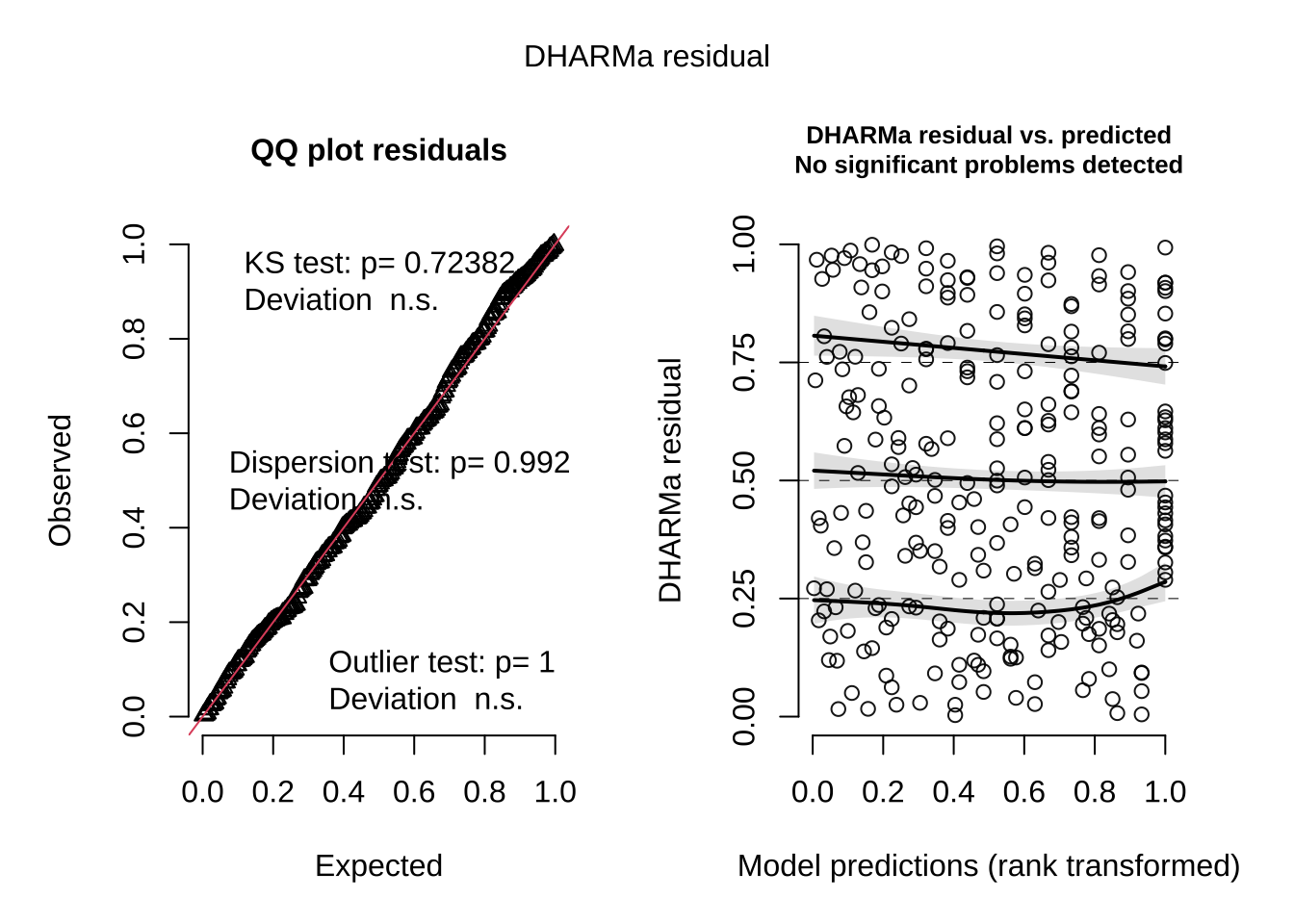
g. Visualize the model predictions
# create model predictions across the observed range of visual obstruction
mod_preds <- ggpredict(
  model2,
  terms = "vo_nest"
)

# plot underlying data and model predictions with 95% confidence intervals
ggplot(mopl_clean, # start with mopl_clean data frame
       aes(x = vo_nest, # use vo_nest column as x-axis
           y = used_bin)) + # use used_bin column as y-axis
  # show observed data
  geom_point( # first layer: individual observations as points
    size = 2.5, # change size of the points
    shape = 21, # open circle
    color = "darkorange" # change color of points to darkorange
  ) +
  geom_ribbon( # second layer: 95% confidence interval ribbon
    data = mod_preds, # use mod_preds data frame
    aes(
      x = x, # set x-axis
      y = predicted, # set y-axis
      ymin = conf.low, # lower bound of the ribbon
      ymax = conf.high # upper bound of the ribbon
    ),
    alpha = 0.3, # change opacity
    fill = "skyblue" # change color of ribbon to skyblue
  ) +
  geom_line( # third layer: add predicted probability line
    data = mod_preds, # use mod_preds data frame
    aes(x = x, # set x-axis
        y = predicted), # set y-axis
    linewidth = 1.2, # make line width thicker
    color = "navy" # change color of the line to navy
  ) +
  scale_y_continuous(limits = c(0, 1), # make y-axis go from 0 to 1
                     breaks = c(0, 0.25, 0.5, 0.75, 1)) + # put tick marks at 0, 0.25, 0.5, 0.75, and 1
  labs(
    x = "Visual obstruction at nest (cm)", # label x-axis
    y = "Probability of Mountain Plover nest site use" # label y-axis
  ) +
  theme_classic() # choose theme without gridlines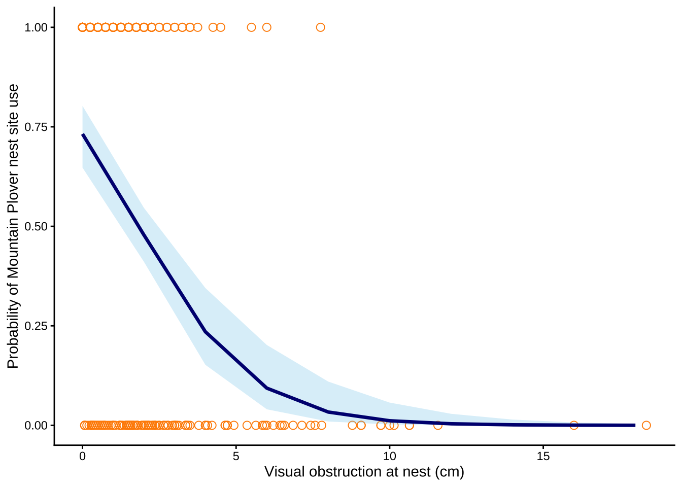
h. Write a caption for your figure
Figure 1. Predicted probability of Mountain Plover decreases as the visual obstruction at the nest increases.
Orange open circles represent observed values for used and available nest sites, the navy line represents predicted probabilities from the selected logistic regression model, and the blue shaded ribbon represents 95% confidence intervals around the model predictions. Data source: Duchardt, Courtney; Beck, Jeffrey; Augustine, David (2020). Data from: Mountain Plover habitat selection and nest survival in relation to weather variability and spatial attributes of Black-tailed Prairie Dog disturbance [Dataset]. Dryad. https://doi.org/10.5061/dryad.ttdz08kt7.
i. Calculate model predictions
gtsummary::tbl_regression(model2, # creates a regression summary table for model2
exponentiate = TRUE) # odds ratios instead of lod-ratios | Characteristic | OR | 95% CI | p-value |
|---|---|---|---|
| vo_nest | 0.58 | 0.47, 0.69 | <0.001 |
| Abbreviations: CI = Confidence Interval, OR = Odds Ratio | |||
ggpredict( # calculate predicted probability of Mountain Plover nest site occupancy
  model2, # select model2
  terms = "vo_nest [0]") # when visual obstruction at the nest is 0 cm
# Predicted probabilities of used_bin
vo_nest | Predicted | 95% CI
--------------------------------
0 | 0.73 | 0.65, 0.80j. Interpret your results
Mountain Plover nest site occupancy was highest when visual obstruction was low, and with every 1 cm increase in visual obstruction, the odds of Mountain Plover occupying a nest site decreased by a factor of 0.58 (95% CI: [0.47, 0.69], p = <0.001, α = 0.05). At 0 cm visual obstruction, the predicted probability of nest site occupancy was 0.73 (95% CI: [0.65, 0.80]), indicating that plovers strongly prefer open nesting areas. As shown in Figure 1, the probability of nest site use decreases as visual obstruction increases, suggesting that taller or denser vegetation decreases habitat suitability for Mountain Plovers. This pattern likely occurs because Mountain Plovers nest in open habitats with short, sparse vegetation and large amounts of bare ground, which allows them to detect predators and blend into the surrounding soil. Distance to prairie dog colony edge was not included in the best-supported model and therefore did not appear to explain occupancy as well as visual obstruction in this dataset.
Problem 4. Affective and exploratory visualizations
a. Comparing visualizations
How are the visualizations different from each other in the way you have represented your data?
My affective visualization used background, brightness, and illustrations of hobbies/people/etc. to represent individual observations, which is completely different from strict box and whisker plot with numerical axis and labels in my initial exploratory visualization. My affective visualization attempted to evoke emotions and aesthetically communicate the result instead of numerical, logos approach with exploratory visualization.
What similarities do you see between all your visualizations?
I incorporated the median line from box and whisker plot in my exploratory visualization to my affective visualization, which was similar. I also used illustration of phone (rectangular) in my affective visualization as a medium of showing the boxplot, which was similar to the exploratory visualization.
What patterns (e.g. differences in means/counts/proportions/medians, trends through time, relationships between variables) do you see in each visualization? Are these different between visualizations? If so, why? If not, why not?
Higher median screen time for school days and lower median screen time for non-school days are depicted and are same in both of my visualizations. They are both illustrated based on the same data/results, and individual observations between school and non-school days are also delineated similarily as well. The medium of communication is different, but both visualizations show the same pattern/trend from personal data collection
What kinds of feedback did you get during week 9 in workshop or from the instructors? How did you implement or try those suggestions? If you tried and kept those suggestions, explain how and why; if not, explain why not.
My peers told me that I should incorporate colors in my affective visualization because I initially started with just pencil, which was hard to show the “brightness” aspect with pencil drawings. To incorporate their ideas, I deviated to using Canva because I do not own many colored pen/pencils to color my intended depiction of the results. I listened to their opinions because I’m not a very creative person and I thought that it was a very valid point, and it was me who asked during the presentation in workshop whether or not I should add colors.
b. Designing an analysis
One analysis I could use is Student’s or Welch’s two-sample t-test comparing total screen time between school days and non-school days.
This analysis is appropriate because my question asks whether average screen time differs depending on the type of day. My response variable is total screen time, measured in minutes, which is a continuous variable. My predictor variable is day type, which has two categories of school day and non-school day, which is binary categorical variable. Student’s/Welch’s two-sample t-test is used to test for this kind of situation: testing whether the mean of a continuous response variable differs between two independent groups, depending on whether the variance is equal or not for 2 groups. If the screen time data does not meet assumptions (heavily skewed, contain strong outliers, not approximately normally distributed), then I could instead use a Mann-Whitney U test. This test is appropriate because it does not require the response variable to follow a normal distribution and can still be used to compare two independent groups.
c. Check any assumptions and run your analysis
mydata_clean <- mydata |> # store mydata data frame in new object mydata_clean
  clean_names() |> # clean column names to only have lowercase and underscores
  select(day_type, screen_time_min) |> # select columns to only have day_type and screen_time_min
  mutate(day_type = str_trim(day_type)) # fix string issues on excel sheet


ggplot(data = mydata_clean, # starting data frame
       aes(sample = screen_time_min, # y-axis for a QQ plot
           color = day_type)) + # coloring points by day type
  geom_qq_line(color = "blue") + # reference line in blue
  geom_qq() + # actual points for the QQ plot
  facet_wrap(~ day_type) + # creating two panels
  theme(legend.position = "none") #taking out legend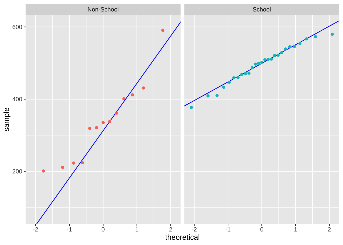
var_test <- var.test( # Function for F test and store result in var_test object
  screen_time_min ~ day_type,  # formula: response variable ~ grouping variance
  data = mydata_clean # mydata_clean data frame
)

print(var_test) # print variance test
    F test to compare two variances

data:  screen_time_min by day_type
F = 4.3845, num df = 12, denom df = 26, p-value = 0.001567
alternative hypothesis: true ratio of variances is not equal to 1
95 percent confidence interval:
  1.760244 13.142802
sample estimates:
ratio of variances
          4.384501
welch_test <- t.test(screen_time_min ~ day_type, # store t test result between screen_time_min and day_type in new object welch_test
data = mydata_clean, # use mydata_clean data frame
var.equal = FALSE) # variance are not equal: Welch's t test
welch_test # print welch_test result
    Welch Two Sample t-test

data:  screen_time_min by day_type
t = -4.9996, df = 14.698, p-value = 0.0001683
alternative hypothesis: true difference in means between group Non-School and group School is not equal to 0
95 percent confidence interval:
 -228.65040  -91.79404
sample estimates:
mean in group Non-School     mean in group School
336.0000 496.2222 cohen.d(screen_time_min ~ day_type, # calculates Glass's delta for screen_time_min across the groups in day_type
data = mydata_clean, # use mydata_clean data frame
pooled = FALSE) # uses separate group standard deviations
Glass's Delta

Delta estimate: -3.058814 (large)
95 percent confidence interval:
    lower     upper
-4.031607 -2.086020
d. Create a visualization
mydata_summary <- mydata_clean |> # start with mydata_clean data frame storing in new object mydata_summary
  group_by(day_type) |> # group by day type
  summarize(mean = mean(screen_time_min), # calculate mean screen time for each day type
            n = length(screen_time_min), # count number of observations
            sd = sd(screen_time_min), # calculate standard deviation for screen time in each group
            se = sd/sqrt(n), # calculate standard error
            lower_ci = mean - qt(0.975, df = n-1) * se, # calculate lower bound CI
            upper_ci = mean + qt(0.975, df = n - 1) * se) # calculate upper bound CI


ggplot(data = mydata_summary, # use the summary data frame
       aes(x = day_type, # choose x-axis
           y = mean, # choose y-axis
           color = day_type)) + # change color by day type
  geom_point(size = 3) + # plot the mean
  geom_errorbar( # plot the standard deviation
    aes(ymin = lower_ci, # set lower bound of errorbar to lower bound CI
        ymax = upper_ci), # set upper bound of errorbar to upper bound CI
    width = 0.05 # change width of errorbar
  ) +
  geom_jitter(data = mydata_clean, # start with mydata_clean data frame
              height = 0, # no jitter vertically
              width = 0.1, # tighten horizontal jitter
              alpha = 0.7, # decrease opacity
              shape = 21, # change shape to open circle
              aes(x = day_type, # choose x-axis
                  y = screen_time_min, # choose y-axis
                  shape = day_type)) + # change shape by day type
  labs(title = "Screen Time Differs between School Day and Non-School Day", # label title
       x = "Day Type", # label x-axis
       y = "Screen Time (minutes)") + # label y-axis with units
   scale_color_manual(values = c("School" = "skyblue4", # custom blue
                                "Non-School" = "red3")) + # custom orange
  theme_light() + # change ggplot theme to light
  theme(legend.position = "none") # delete legend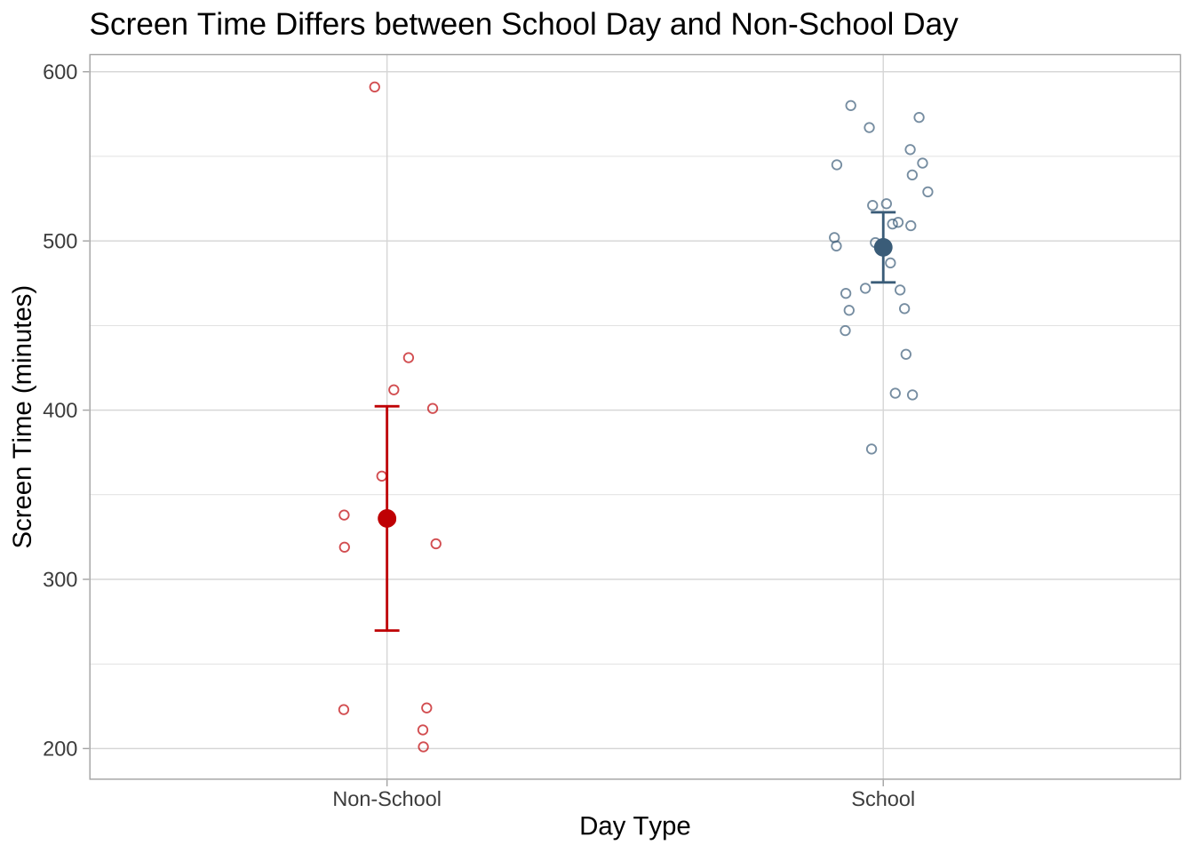
e. Write a caption
Figure 2. Mean screen time is higher on school days than on non-school days.
Smaller, open circles show the underlying screen time observations (minutes) for each day type, with red points representing non-school days and sky blue points representing school days. The larger filled circles indicate the group means, and the vertical error bars show the 95% confidence intervals around each mean. Overall, the figure shows that average screen time was higher on school days than on non-school days. Data collected March 3, 2026.
f. Write about your results
We found a large (Glass’s delta = -3.06) effect of day type on mean screen time between School day and Non-school day (Welch’s two-sample t-test, t(14.70)=−5.00, p = <0.001, α = 0.05). On average, screen time was about 160.2 minutes higher on school days than on non-school days, with mean screen time of 496.2 minutes on school days and 336.0 minutes on non-school days (the 95% confidence interval: [91.8, 228.7] minutes).